Measuring spatial and contextual variation
EPID 594
Spatial Epidemiology
University of Michigan School of Public Health
Jon Zelner
[email protected]
epibayes.io

Today’s Theme

Making the most of multi-level data using hierarchical models
Agenda
Brief recap of the threefold path of hierarchical modeling
Radon ☢️ lab 🧪 !
Preview of next week
Let’s extend the blood pressure model from Merlo et al. to include a risk/protective factor.
Simulated study where we sample 1000 individuals (\(i\)) from 20 neighborhoods (\(j\)) and measure:
\(y_{ij}\) is continuous systolic blood pressure (SBP) for individual \(i\) in location \(j\).
\(x_i \in [0,1]\) is a binary exposure indicating whether the individual gets regular physical exercise.
\(\beta\) is an increase in \(y_i\) associated with the exposure
\(\alpha\) is mean SBP in the absence of exposure
How can we deal with the fact that people are clustered within locations?
You have three choices: Which 🚪 will you choose?
Door 🚪 #1: Ignore clustering and fit a normal GLM
Pool data across all units, i.e. ignore clustering.
i.e. fit model \(y_{ij} = \alpha + \beta x_i + \epsilon_i\)
Is this typically a good idea?
NO!

Complete pooling ignores potential sources of observed and unobserved unit-level confounding.
Full pooling of clustered data violates assumption of independent errors
A fully pooled model:
\[ y_i = \alpha + \beta x + \epsilon_i \]
Assumes \(y_i\) is a combination of systematic variation (\(\alpha + \beta x\)) and uncorrelated random noise (\(\epsilon_i\)) where:
\[ \text{i.i.d.} \epsilon \sim Normal(0, \sigma^2) \]
Your residuals should look like this
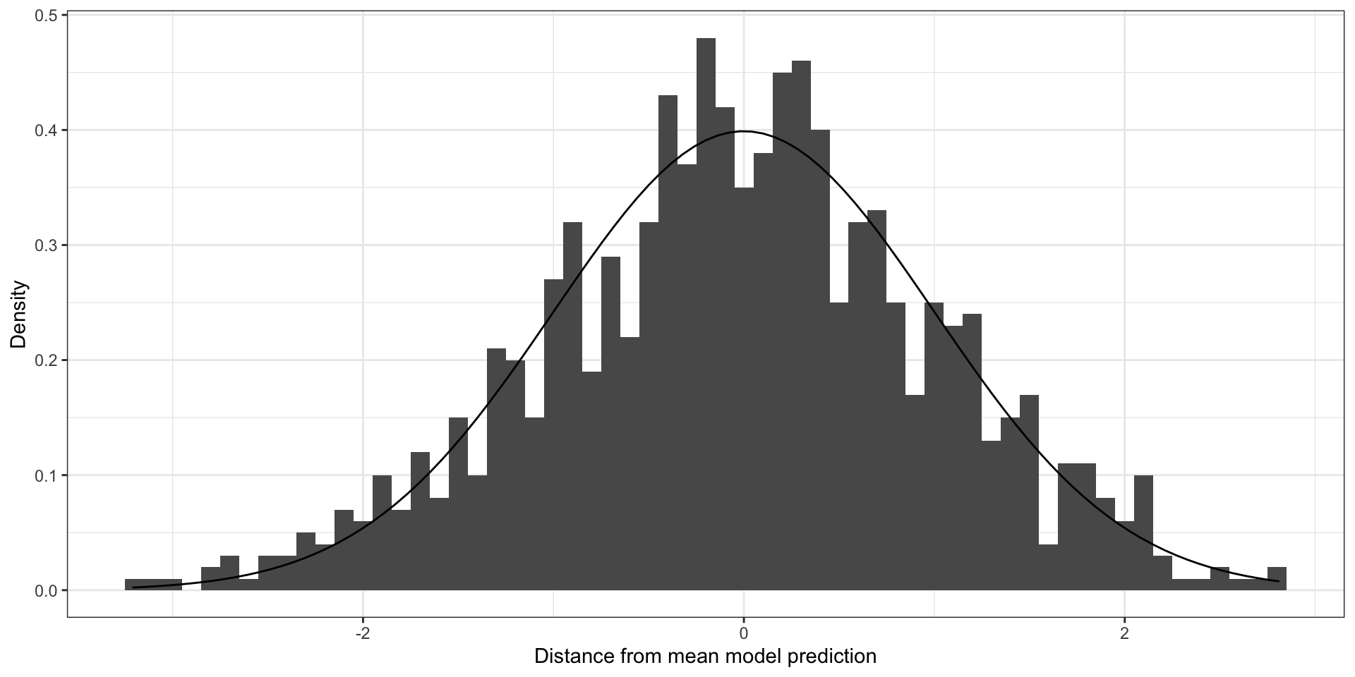
Residuals for a model with un-clustered errors
Your residuals should look like this
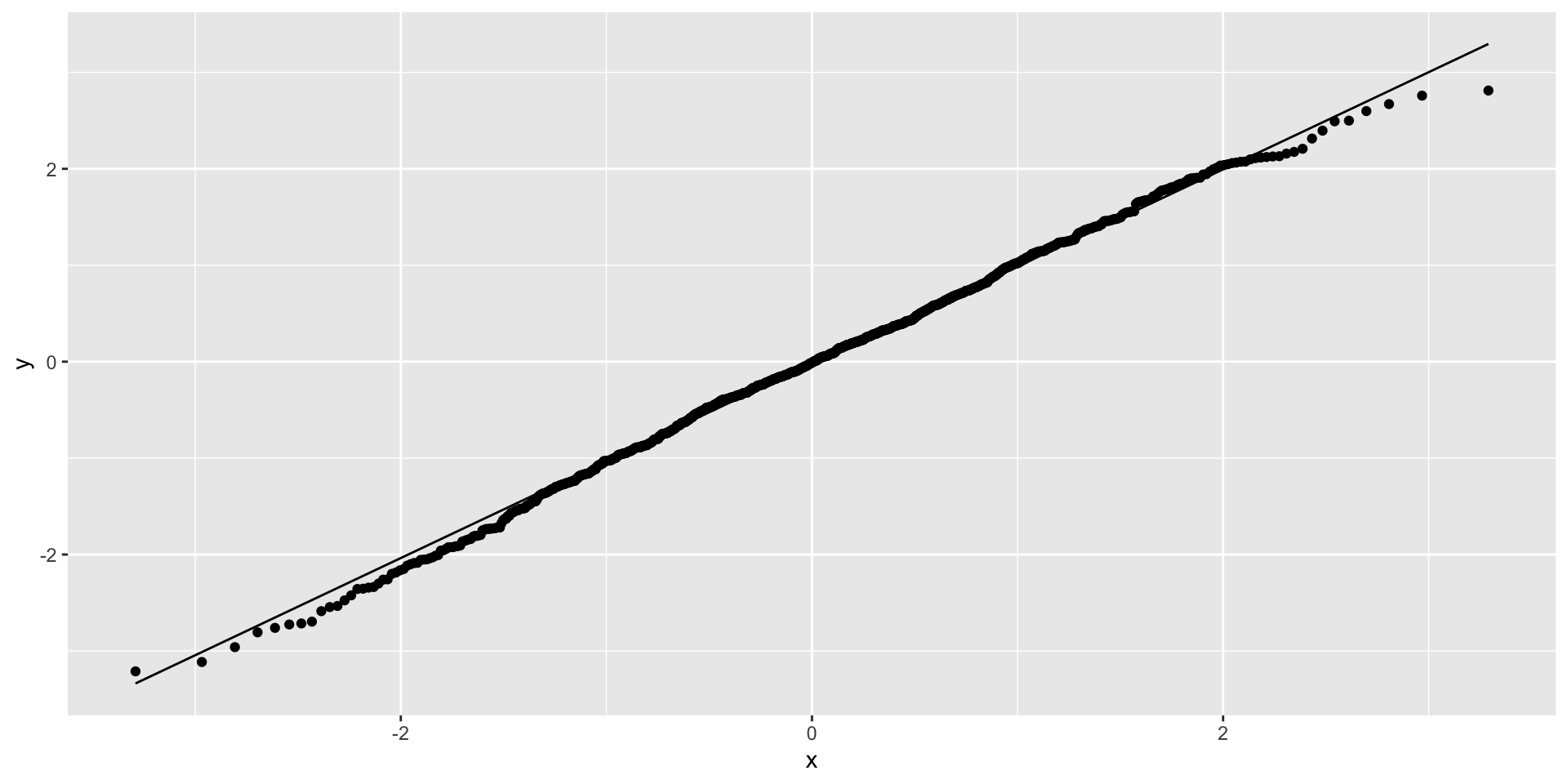
Residuals for a model with un-clustered errors
If you ignore strong 💪 clustering (ICC = 0.9)
Code
require(ggplot2)
icc <- 0.9
total_var <- 1
cluster_sigma <- sqrt(icc * total_var)
ind_sigma <- sqrt((1 - icc) * total_var)
ind_cluster <- 100
ncluster <- 10
cluster_ids <- sort(rep(1:ncluster, ind_cluster))
cluster_means <- rnorm(ncluster, sd = cluster_sigma)
ind_vals <- rnorm(n = length(cluster_ids), mean = cluster_means[cluster_ids], sd = ind_sigma)

df <- data.frame(x = ind_vals, cluster = cluster_ids)

g <- ggplot(df, aes(x = x, cluster = cluster_ids)) +
  geom_histogram(binwidth = 0.05, aes(y=..density..)) +
  xlab("Distance from mean") +
  ylab("Density") +
  stat_function(fun = dnorm, args = list(mean = 0, sd = sqrt(total_var))) +
  theme_bw()


plot(g)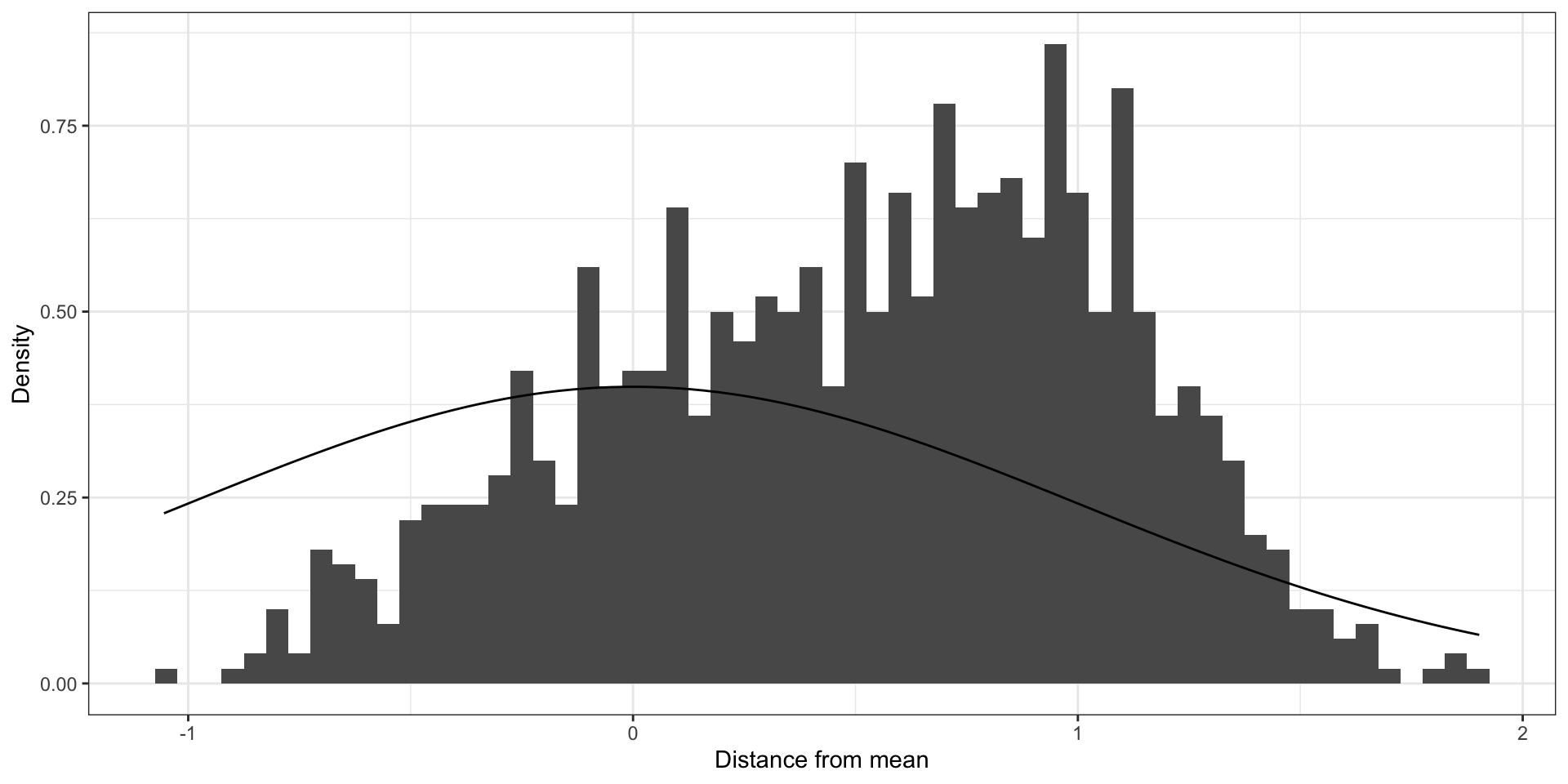
Clustered errors that are far from being normal
If you ignore strong 💪 clustering (ICC = 0.9)
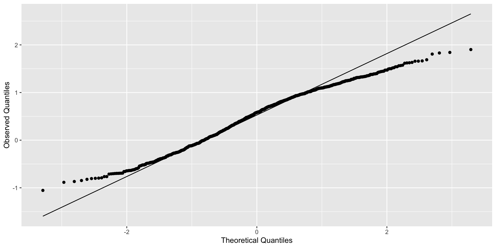
Qqplot of residuals
If you ignore moderate clustering (ICC = 0.5)
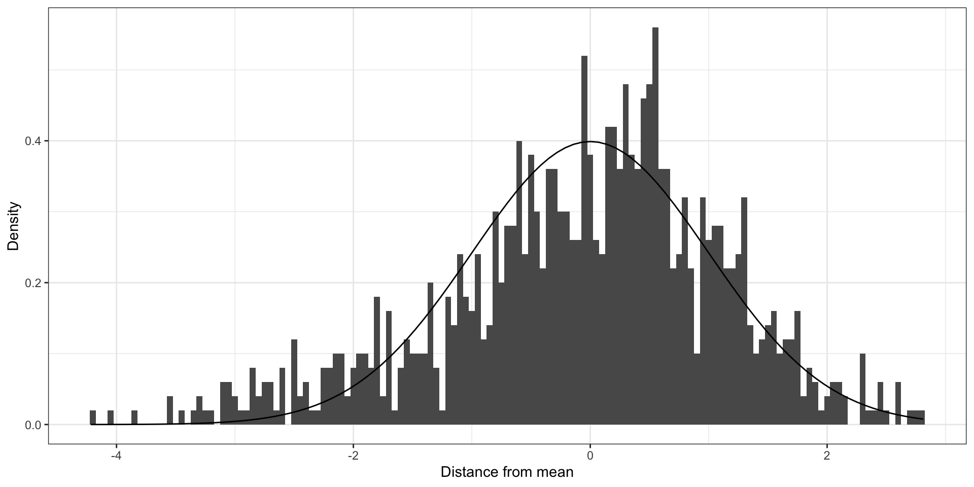
Moderately clustered errors
If you ignore moderate clustering (ICC = 0.5)
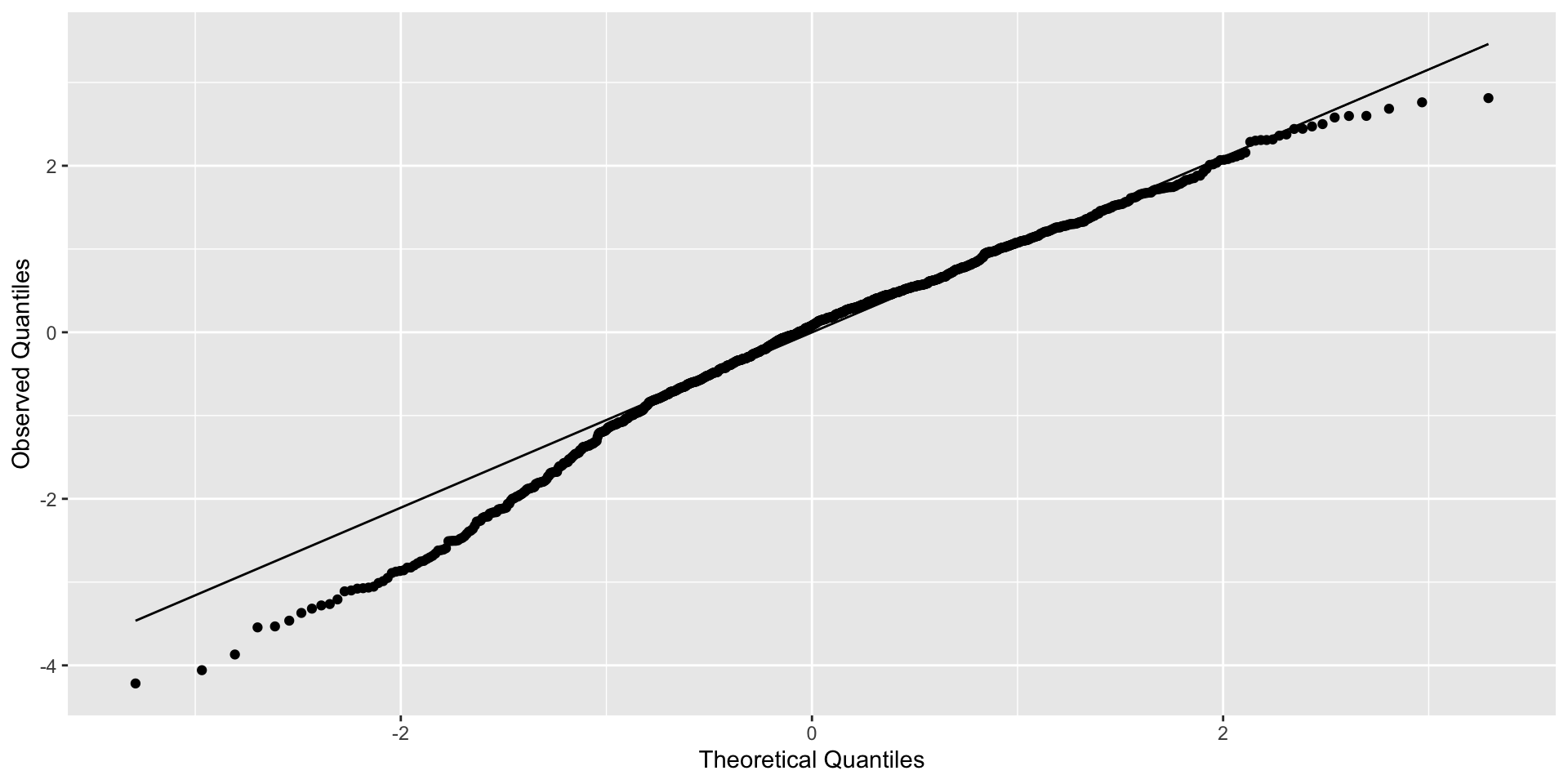
Example of residuals for model with clustered errors
If you ignore weaker clustering (ICC = 0.25)
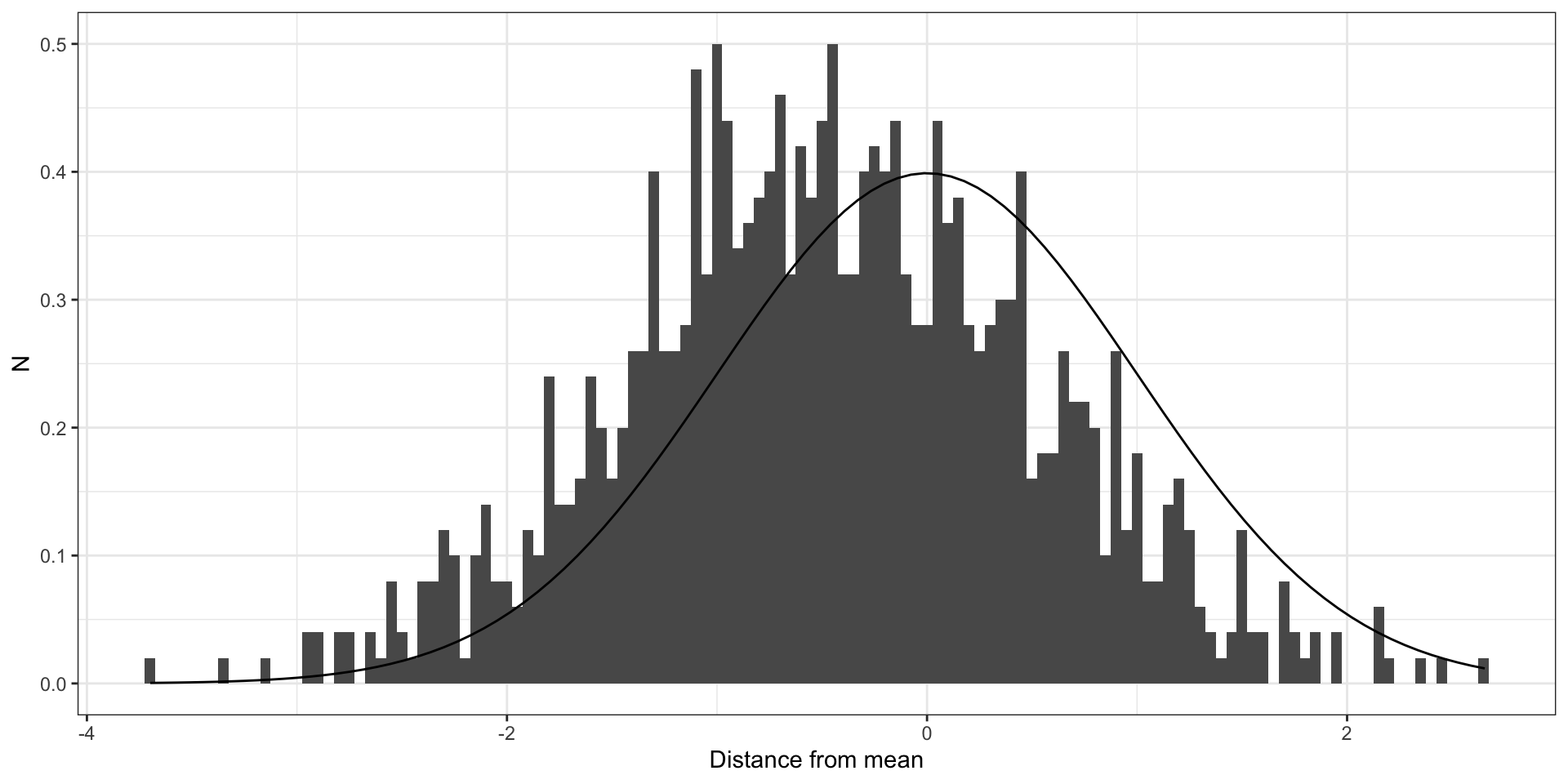
Clustered errors
If you ignore weaker clustering (ICC = 0.25)
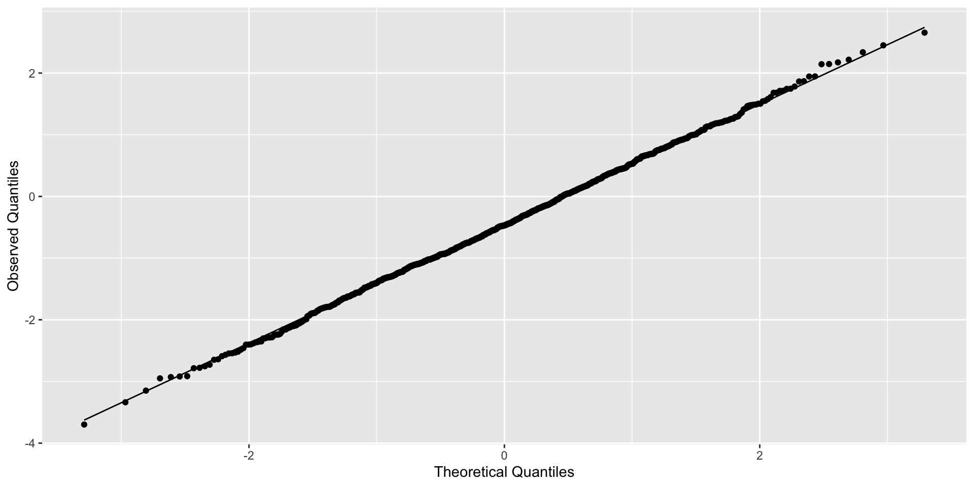
Example of residuals for model with clustered errors
Door 🚪 #2: Fit a different model to each cluster
Unpooled approach:Fit a separate model to each unit (\(j\)), assuming outcomes in each unit are independent:
Model looks like: \(y_{ij} = \alpha_j + \beta_j x_i + \epsilon_{ij}\)
Where: \(\epsilon_{ij} \sim N(0, \sigma_{j}^2)\)
More danger!

Totally unpooled models run the risk of overfitting the data, particularly in small samples.
Specific dangers of unpooled models
Some places may have few observations, making unpooled models impractical
We may want to allow the effect of an exposure to be consistent across location.
Will have nothing to say about data from a new location
How would our ideal model split the difference between fully pooled and totally unpooled?
Encode the assumption that places are similar unless data tell us otherwise.
Be flexible enough to reflect information in new data without overfitting.
Give answers equivalent to the fully pooled and unpooled approaches if that is what the data actually suggest.
Door 🚪 #3: Partial Pooling 🏊!
Allow effects to vary across clusters, but constrain them to come from the same distribution:
Model looks like: \(y_{ij} = \alpha + \beta x_i + \epsilon_{i} + \epsilon_{j}\)
Where: \(\epsilon_{i} \sim N(0, \sigma_{i}^2)\)
And: \(\epsilon_{j} \sim N(0, \sigma_{j}^2)\)
What does partial pooling get us?
This approach accommodates variation across units without assuming they have no similarity.
Allows us to include covariates both about individuals and their spatial context.
More likely to make accurate out-of-sample predictions than the fully-pooled or unpooled examples.
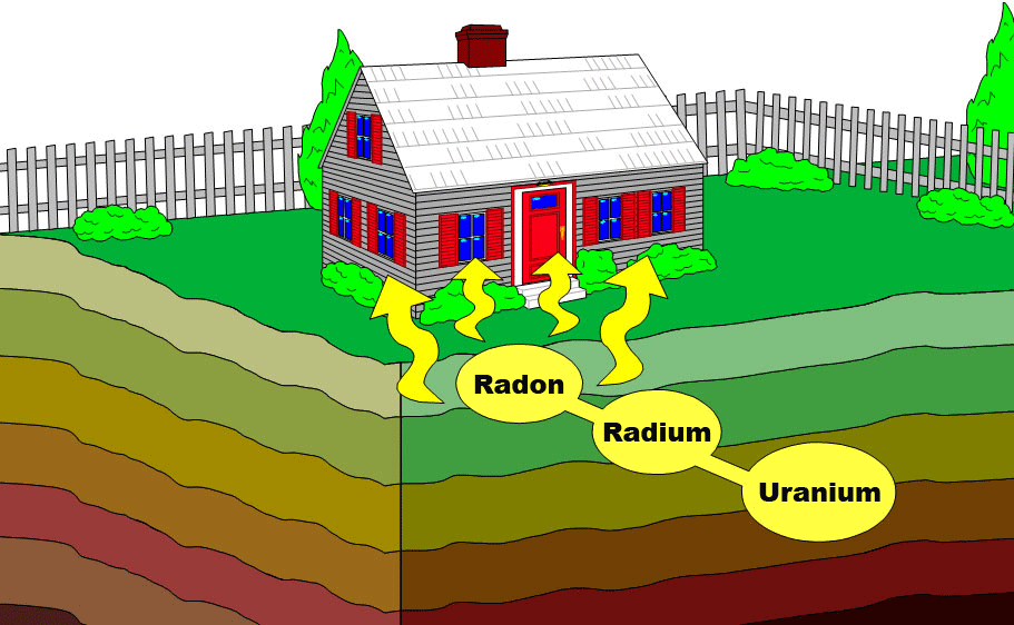
Radon!
Imagine you’re in the radon system business
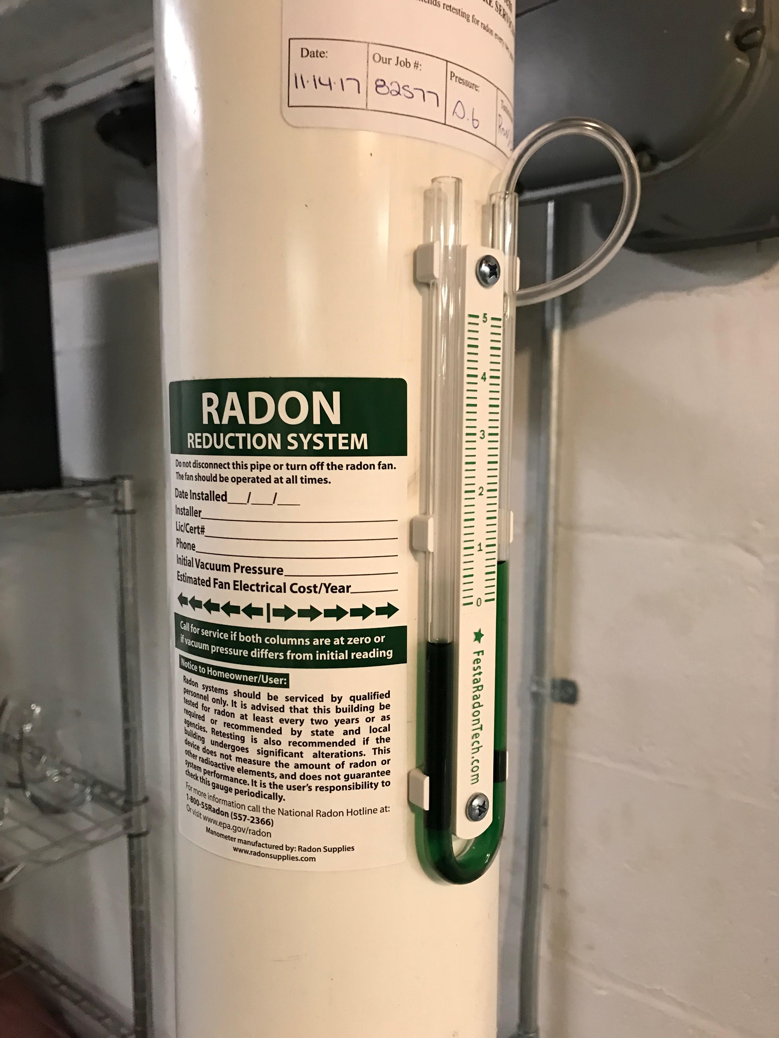
My very own radon mitigation system!
How could you use/extend the partial pooling model from the Gelman paper to:
Sell more radon systems in Minnesota?
Reduce the burden of inequality in radon-associated health risks in Minnesota?
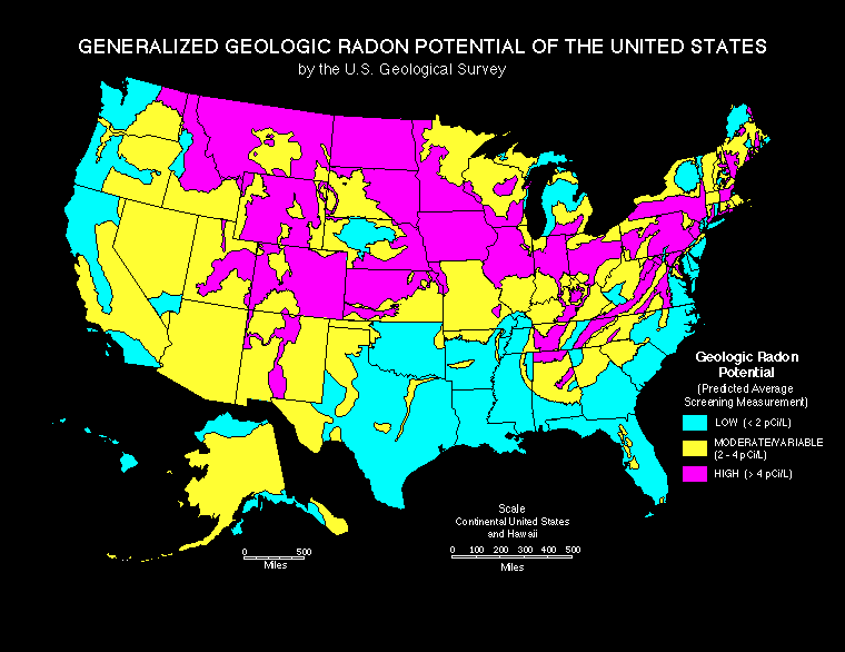
Branch out into other markets, like Michigan, where we have good measurements of soil uranium but don’t have access to household-level radon measurements?
05:00
As the soil uranium ☢️ increases, so does baseline county-level radon
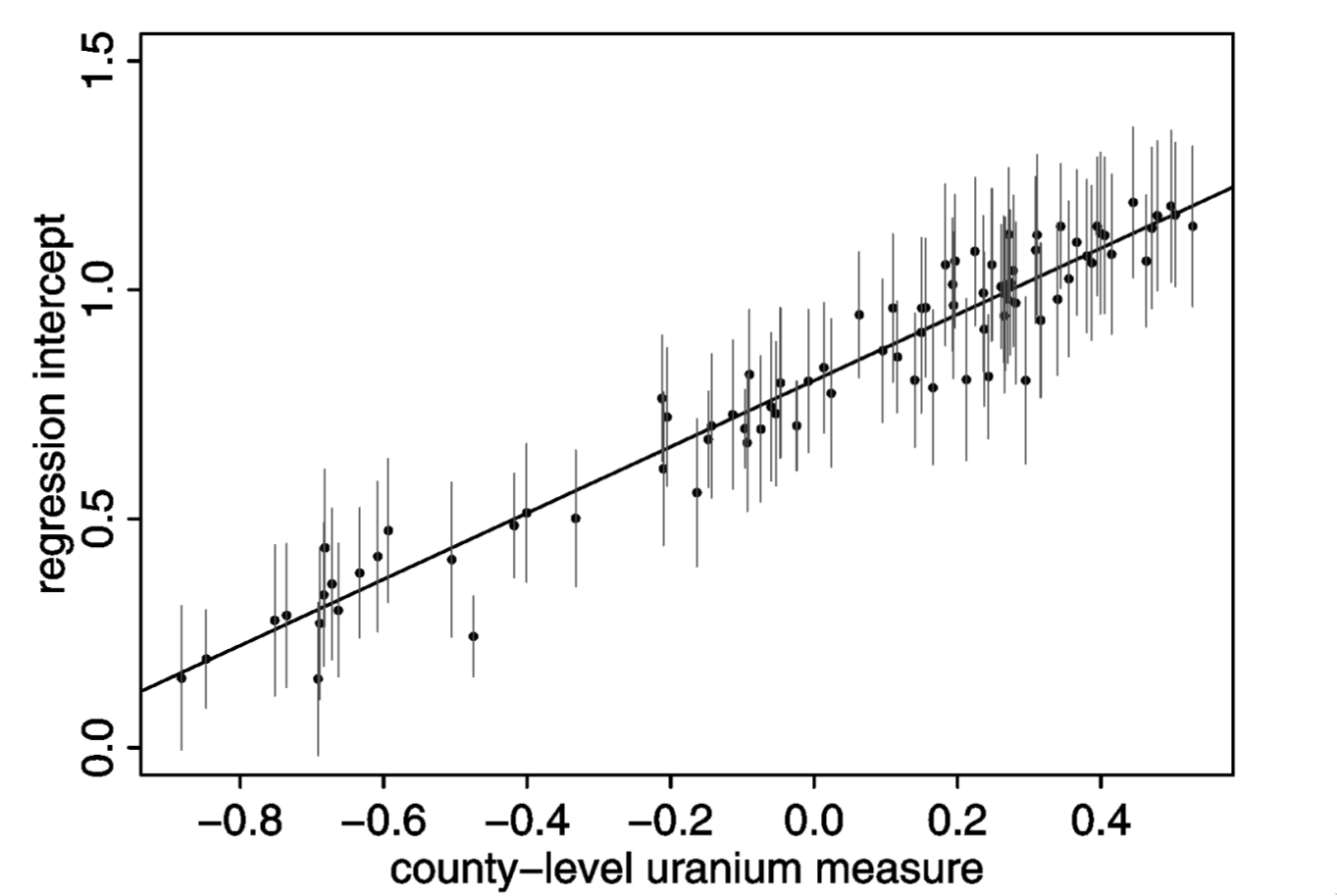
Counties with lots of soil uranium seem like a good bet for business
Partial pooling most benefits predictions for places with less data
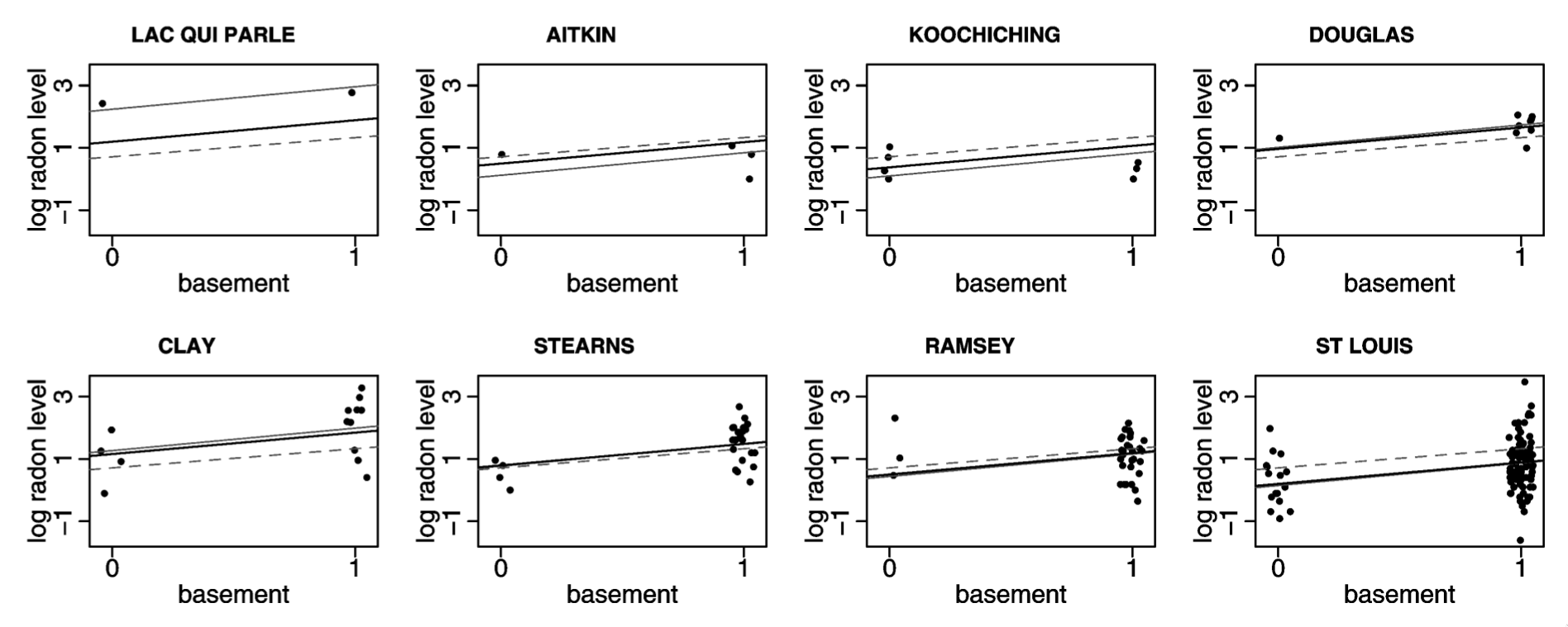
Light dotted line = full pooling; Light solid line = no pooling; Dark line = partial pooling
Time for a test-drive! 🏎️
